Creating a series of three brochures for different Marriott hotels presented the challenge of maintaining a consistent brand identity while also ensuring each brochure reflected the unique qualities of the individual hotels. The goal was to balance consistency with individuality, so each brochure could stand on its own while still being easily identifiable as part of the Marriott family.
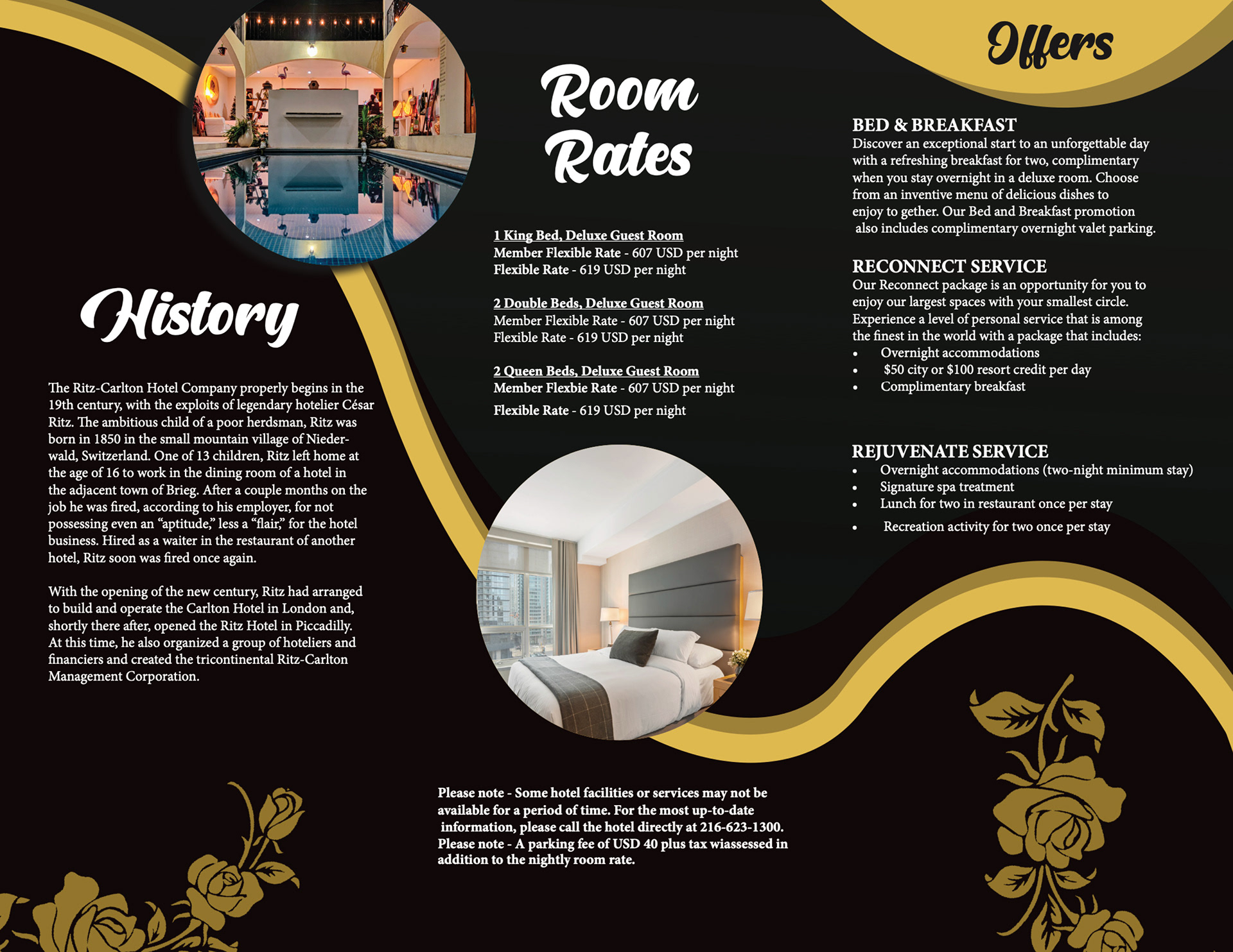
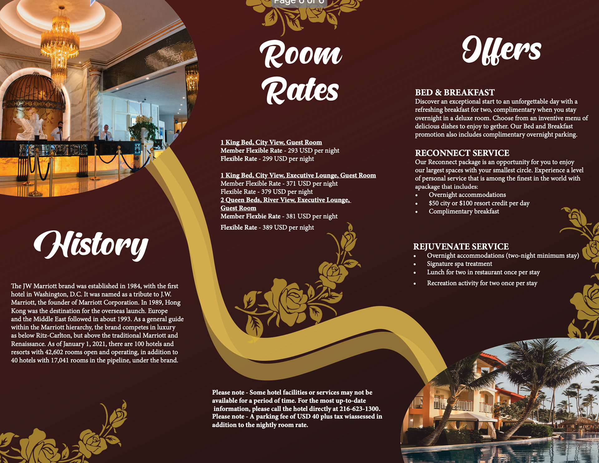
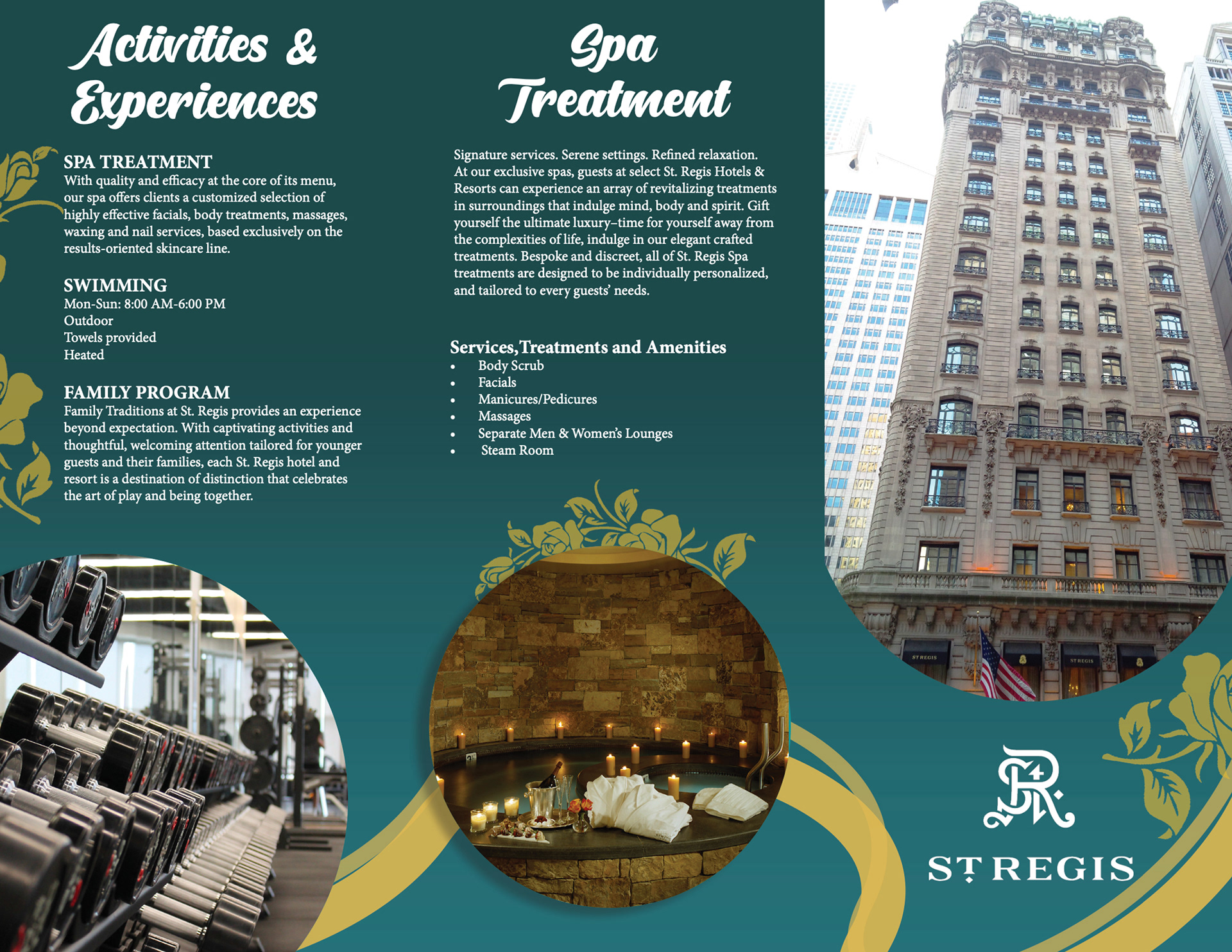
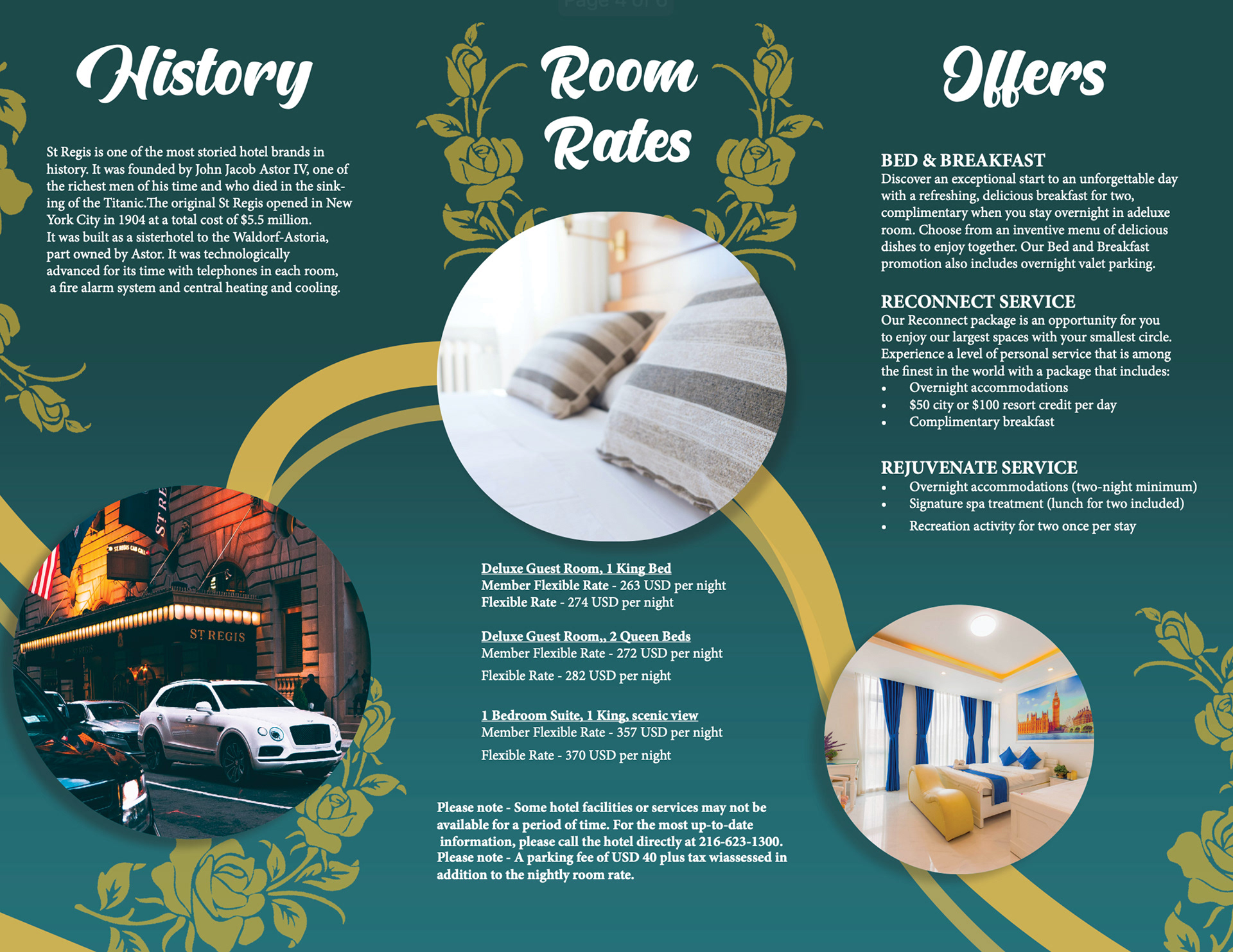
I achieved consistency across all three brochures by incorporating gold accent elements and using identical fonts to create a cohesive feel. To maintain visual interest and prevent the designs from feeling too similar, I utilized gold lines strategically within each brochure to guide the reader’s eye around the layout, ensuring they engaged with all of the information. This approach allowed each brochure to feel unique, highlighting the distinctiveness of each hotel, while still reflecting the upscale and sophisticated atmosphere of Marriott’s brand.
Tools Used: Adobe InDesign